Example of how
to analyze RES data from Uwashington RES system using Matlab.
Tony Gades March 2000
UPDATED LAST: 26-Jun-01 18:26:25
Click Here to Download: Microsoft
Word Version of this Document
Click Here to Download: Adobe
Acrobat .pdf Version of this Document
1) Convert
Raw Data
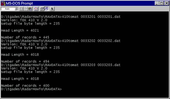
The data need to be converted from the raw compressed binary data format that we gather in the field to an uncompressed binary format that can be read by Matlab routines. This is done using a routine written in C called 410tomat. In this example a profile was done across Ridge BC and was collected in 3 consecutive files: 0033201, 0033202, 0033203
At the MS-DOS prompt, run the conversion routine named 410tomat.exe on each of the files. Useage: 410tomat InputFile Outputfile
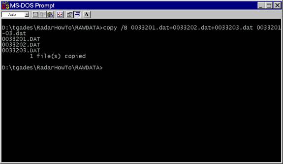
Now, one could concatenate the into one file using the DOS binary copy command. Useage: copy /B file1+file2+.... NewFile
2) Read Converted Data Into Matlab
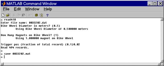
The matlab script read410.m reads these converted binary data. Useage is shown below. The data for this example were collected using a bike wheel diameter of 0.5m with 1 magnet/wheel and the trigger position was 0.02 (fraction of total record length).
For this example I read only the file 0033202.dat (center of the profile) to save time.
Save the file as a matlab file before manipulating it. We now have these arrays:
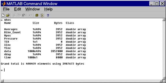
RELEVANT ARRAYS:
Averages: number of stacks in each record
Bike_Count: number of magnet clicks
Hpos: calculated array giving horizontal displacement (m) for the profile
Pressure: digitized pressure record relative to first measurement in bits. Needs to be multiplied by
-0.1078 meters/bit
Xinc: Volts/bit for converting values (not normally useful)
Yinc: Seconds/sample - used for calculating associated time array and for
calculating filter parameters.
data: matrix of the records. Each column is a complete waveform. In this
case there are 494 records of 1000 samples length.
dday: decimal day of year (time) each record was acquired.
time: calculated travel time array for plotting and calculating purposes.
2A) UNIX/SunOS
If you want to use the "read410.m" matlab script to read data on the Unix box (and you have already run 410tomat.exe on them in Windows), you need
to flip the byte order first using the C-program byteflip410
The Unix executable is in the subdirectory:
UNIXFILTERS/byteflip410
(byteflip410.c source code is there as well)
Useage: byteflip410 < INPUTFILENAME >OUTPUTFILENAME
Then you can use "read410.m" to read the data into Matlab. From this point onward, all of the steps of processing in matlab are the same for both systems.
NOTE: To combine raw data files in Unix use the "cat" command in place of the dos binary copy
Useage: cat file1 file2 ... >OUTPUTFILENAME
3) Remove Smoothed Average Signal from record.
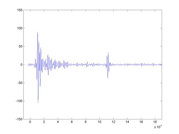
Plotting all the data as lines shows that there is a great deal of signal in common between these records. The common signal is primarily due to intstrumentation.
» plot(time,data);axis([-1e-6 19e-6 0
1024]);
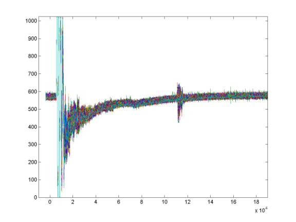
To get rid of this, I subtract a smoothed average record from the data. The mean record is determined first and simply subtracting this from the data works reasonably well but it will remove any real signals that are parallel to the surface - such as shallow internal layering. Instead, I low-pass filter the mean record beyond about 2 microseconds. That smoothed average is then subtracted from the data. A routine to do this is called "demean.m" which in turn calls the "lowpass" routine.
Comparing the mean record and the smoothed mean record shows some of the motivation for this step. Because, for example, the ice thickness in these data is relatively constant and a portion of the bed reflection appears in the mean record - we do not want to subtract real information from the data.
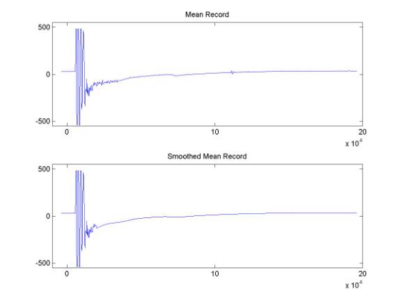
At this point the "data" matrix is no longer simply raw data but "demeaned".
4) Bandpass Filter the Data
Now we need to bandpass filter the "demeaned" data, so we need to know the approximate center frequency of the data - though we probably know it close enough, we could check it roughly by plotting a record, picking a reflection and determining its period and calculating the frequency. Re-windowing to feature the bed reflection would make it easier to pick the peak times of the reflection using the Matlab ginput command. The center frequency for these data is about 5MHz. As a first guess in filtering the data, I use ± 2MHz or so. The routine bandpass can be used to filter the data. The bandpass routine defaults to 1:10Mhz, but we can specify a "freq" array as shown below.

The result of the bandpass filtering yields a "filtdata" matrix that is the filtered version of the original "data" matrix.
At this stage, I clear the "data" matrix and save as a matlab file - 0033202_f.mat. Eliminating extra large arrays or matrices generally makes Matlab run much more quickly.
5) Plotting the Filtered Data
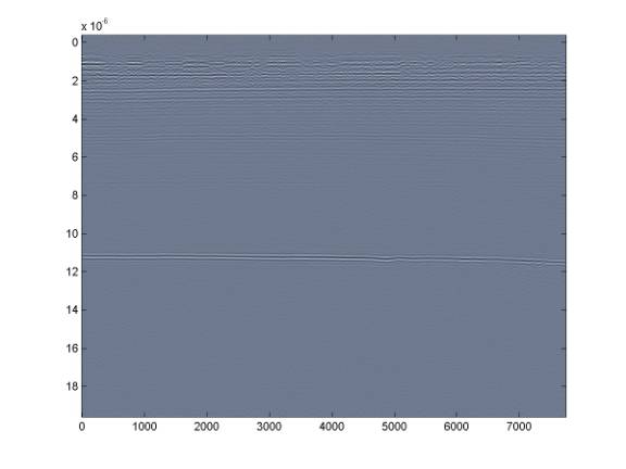
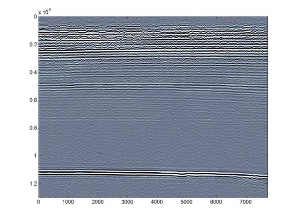
The Matlab plotting routine imagesc together with the "bone" colormap are very good for displaying these data - I no longer bother with the more complex routines I wrote. imagesc allows you to decide the range over which the colormap is spread. These data are now signed 10bit data so they can vary between ± 512. Here is one of the demeaned and filtered records.
If we use imagesc with ± 512, the image would be pretty hopeless - and even spreading the colormap from ±100 is not very good.
This yields the following:
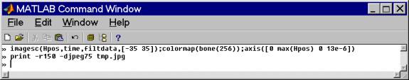
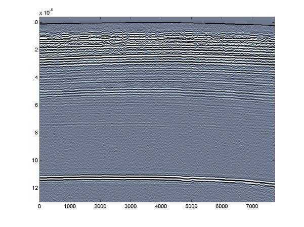
Instead, it is better to use a range on the order of the bed reflection amplitude - in this case about ± 35 and also restricting the plotting axis to the useful data range (there is nothing useful beyond 12 microseconds).
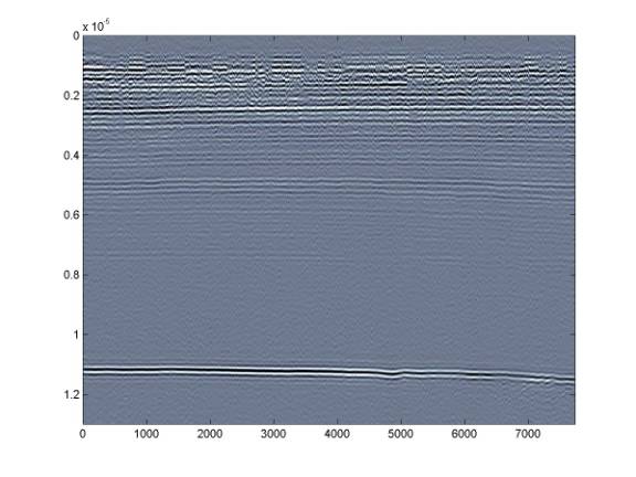
Further restricting the range to something like ± 15 will allow us to see the deeper internal layering - but this comes at the expense of the shallower layers.
The layer at around 7.5 microseconds is much clearer
6) Adjusting the image to show surface topography
using pressure record.
After the data are filtered, one can use the routine f_press to adjust the filtdata matrix. Then one can plot the image in the same way, but now the data will be adjusted to show the surface topography. NOTE: the f_picker routine sometimes does not work properly if you are picking the data after using f_press .
% f_press.m
% tgades, 1994, 1997
% routine to correct the surface
elevation using the pressure transducer values
%
% This routine takes the filtdata
array and shifts each record "vertically" a distance
%
based on the pressure record.
The scaling value of the pressure record was determined
%
from a continuous profile from the summit of Siple Dome down to the
Siple Ice Stream.
%
The true elevation along the path was determined using differential
GPS. From this elevation
%
difference of about 500m, I determined that the best scaling of the
pressure record is -0.1078 m/bit.
%
The shift of each record is scaled to ice thickness using the
"Cice" value.
%
%
Note that the pressure record is lowpass filtered first in the
"presmooth" routine to eliminate
%
the bit-level jitter in the record.
%
This yields the resulting figure. Note that the surface topography can be seen now – though there was little elevation change over the course of this short profile so the surface topography is very slight.
7) Some Tricks for Plotting the Filtered Data
- TRY DIFFERNT COLORMAPS
Matlab comes with many colormaps and sometimes it is useful to try the others. The simple gray map is good for publications.
MATLAB Included Color maps.
hsv - Hue-saturation-value color map.
hot -
Black-red-yellow-white color map.
gray - Linear gray-scale
color map.
bone - Gray-scale with
tinge of blue color map.
copper - Linear copper-tone
color map.
pink - Pastel shades of
pink color map.
white - All white color map.
flag - Alternating red,
white, blue, and black color map.
lines - Color map with the
line colors.
colorcube - Enhanced color-cube
color map.
jet - Variant of HSV.
prism - Prism color map.
cool - Shades of cyan and
magenta color map.
autumn - Shades of red and
yellow color map.
spring - Shades of magenta
and yellow color map.
winter
- Shades of blue and green color map.
summer - Shades of green and
yellow color map.
- TRY THE SPINMAP ROUTINE
spinmap is a routine to use after plotting the data with imagesc. It rotates the current (e.g. bone) colormap for specified time (in Matlab do help spinmap). This sometimes reveals features such as layering that are not obvious. If so, this usually means you need to rethink the range over which you are plotting the data in the imagesc command.
- TRY DIFFERENT FREQUENCY RANGES IN THE
BANDPASS
By varying the width and location of the frequency band, sometimes data which are not very obvious can be recovered. The first thing I tend to do in this regard is to increase the high corner frequency significantly. In this example I bandpassed 5Mhz data from 3:7Mhz. It would be good to try 3:10Mhz next. After that, increase the low corner frequency. Good results often come from having the low corner frequency very near to the center frequency of the data. The high corner frequency does not have as large an effect on the appearance of the images – so long as it is sufficiently above the corner frequency.
-TRY CONSTRUCTING A TIME-GAIN FUNCTION
Because amplitudes in the data necessarily decrease about exponentially, it may be useful for plotting purposes to attempt to normalize the data by applying some sort of time-gain. A good way to begin doing this would be to plot the variation of reflection amplitudes vs. time for the data and then choose some sort of function from that. A simple exponential is a decent place to start.
8) Picking Layers and/or Bed Reflection
f_picker.m
%
f_picker.m
%
Tony Gades. 1995, revisions since
%
Routine to find the maximum and minimum values in the range defined by 2 user
input lines on an image
% plot.
The first step of the routine is to have the user pick a line above the
desired feature by
% clicking with the mouse, then a line below
the feature is determined. The routine
uses the filtdata
% matrix so data must be first bandpassed (or
the data matrix renamed to filtdata).
%
%
Note that other versions of this routine look for maximum slope, minimum
slope etc - these may be
% more useful for some kinds of data such as temperate glacier
data. The simple max/min value works
% well for Antarctic data and this routine also works quite well
on reasonably bright internal layers.
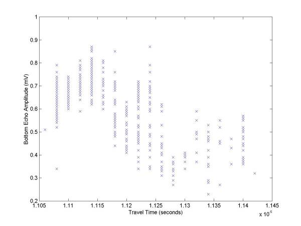
This is an example using f_picker to determine the bed reflection time and amplitude.
Approximate bounds for the max/min search is first chosen with the mouse and those bounds in this case are shown as heavy red lines. The maximum value determined for these data within the bounds is shown as a faint red line.
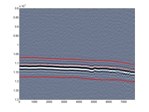
The f_picker routine produces a few plots that may be useful. This 2 panel plot shows the bed reflection max/min timing in the upper panel and then the relative amplitude of the reflection.
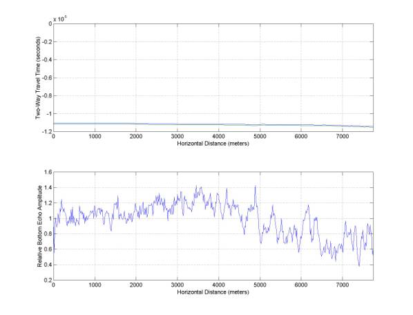
Also, the amplitude vs. travel time is plotted – this is useful for determining if the reflection amplitude shows any anomalies or if it simply varies with depth (which is does mostly in this example).
ROUTINES USED:
Directory
of Tgades Most Recent Version RES Matlab Scripts
Tgades
Most Recent Version Matlab Scripts As A Zip File
410tomat.exe
read410.m
demean.m
lowpass.m
bandpass.m
new_fig.m
f_picker.m
f_press.m
presmooth.m