What are they?
Earthquake Impact Pages summarize the significance of an earthquake in
terms 'Alert' response levels; no
(green), local/regional (yellow), national (orange), or international
(red) level response needed. These levels are based on total
shaking-related economic losses expected for impacted structures and
their contents and non-structural damage and service disruptions, but
do not include losses due to secondary earthquake affects like fire,
tsunamis, etc. Losses are estimated using the
ShakeMap shaking intensities, historical and modern data about losses
in past earthquakes associated with each intensity level, economic
assets, and the number of
people exposed to each intensity. To derive these estimates
quickly and uniformly, instead of using databases of building and
facilities inventories and vulnerabilities (which don't exist in many
places) to measure economic assets, more readily available data on
country or region-specific market values of goods and services (the
Gross Domestic Product) are used instead as proxies.
 |
> 1
billion$
100 million to 1 billion $
1 to 100 million $
< 1 million $
|
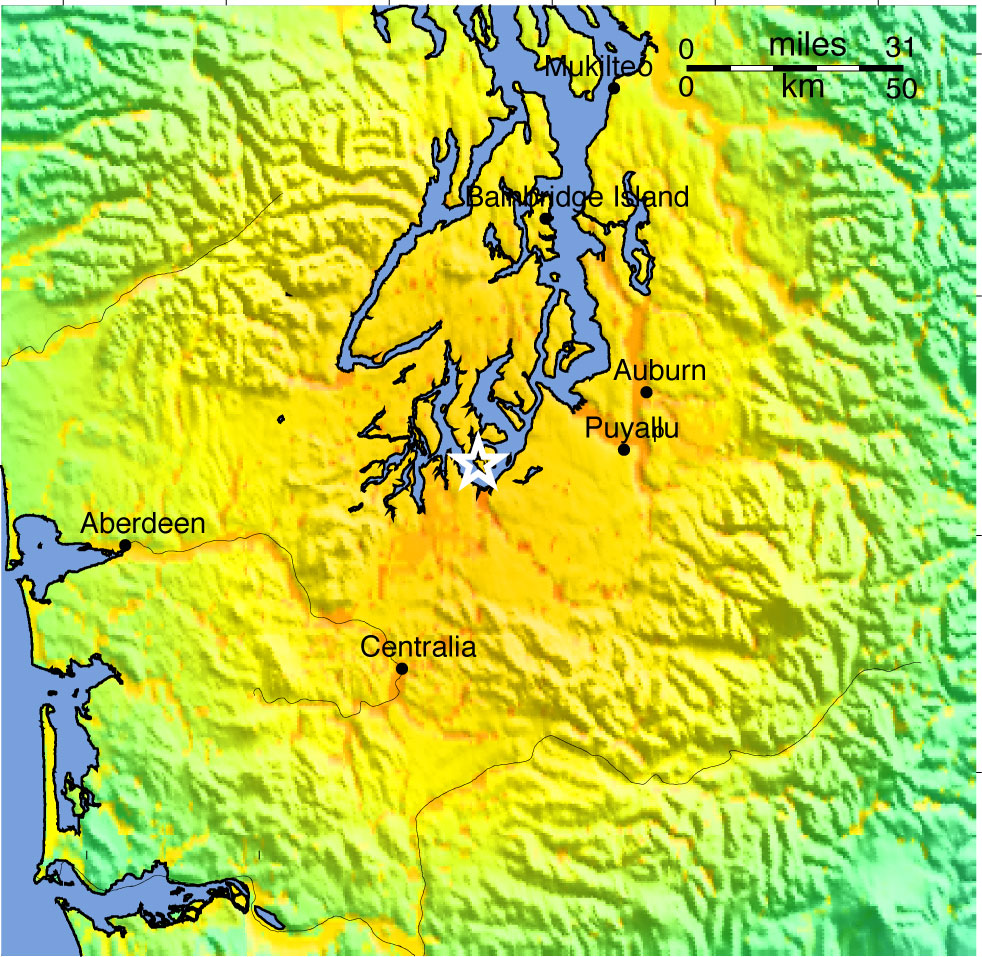
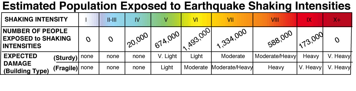
Earthquake Impact Pages show the
total population in the mapped area
exposed to each shaking intensity level, using the ShakeMap intensity
scale (same scale as in section above).
|
 |
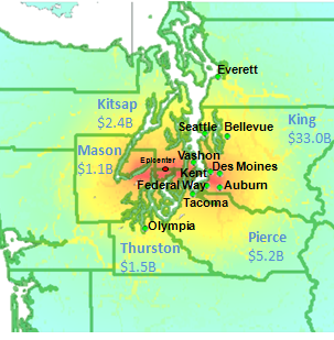
Earthquake Impact
Pages also show the distribution of economic loss among
the most affected counties and cities, in map and table formats.
|
|
| The estimated
aggregate losses in each county are plotted on top of the ShakeMap,
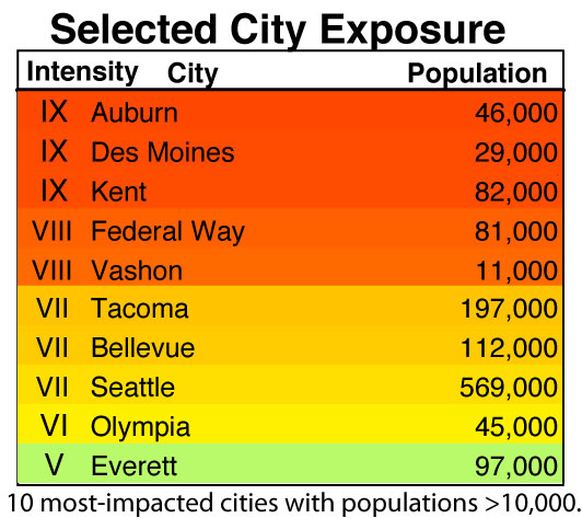
with the 10 most-impacted cities with >10,000 people noted. |
A table lists each city on the
map with its population and the shaking intensity it experiences noted
by its numeric value and corresponding color.
|
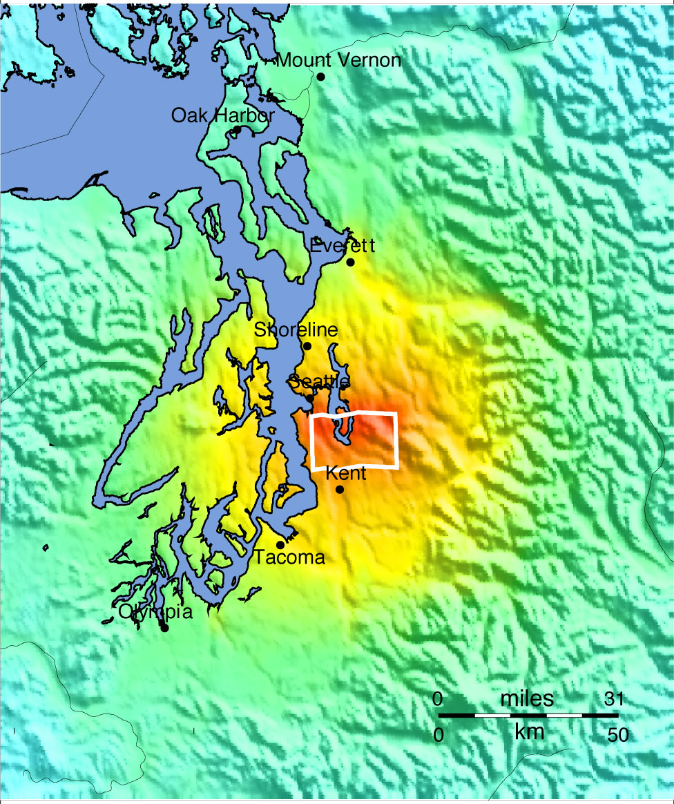
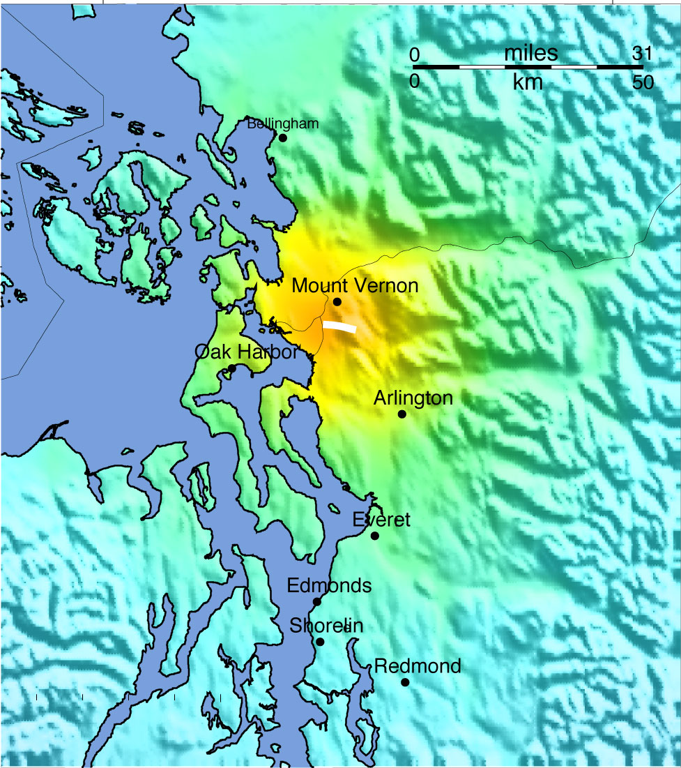
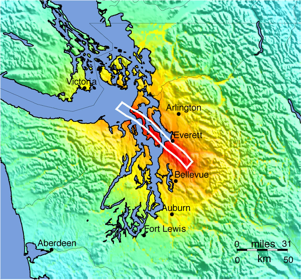
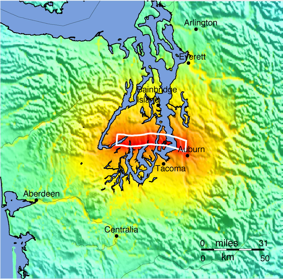
2012
Evergreen
Earthquake
Exercise Example Earthquake Impact Page
An
example Earthquake Impact
Page for the M7.1 Tacoma Fault earthquake
scenario may be viewed (right mouse button) or downloaded (left mouse
button) by clicking on this link.